The Soft Power of Butter Yellow in Summer

Butter yellow is the rare summer color that can brighten an outfit without taking it over.
It sits somewhere between cream, pale yellow, and sun-faded ivory, which is why it works with more than yellow usually does. White keeps it fresh, denim makes it easier, black gives it a little edge, olive grounds it, and straw, gold, linen, cotton, and bare skin all seem to know what to do with it.
I have never found yellow to be the easiest color to wear, mostly because it can become loud very quickly. Bright yellow carries energy, optimism, and warmth, but in clothing it can also feel sharp, especially in the kind of summer heat where nothing needs to be working harder than it already is. Butter yellow gives the best part of yellow without the glare. It still feels positive and sunlit, but it is softened enough to feel calm, open, and elegant.
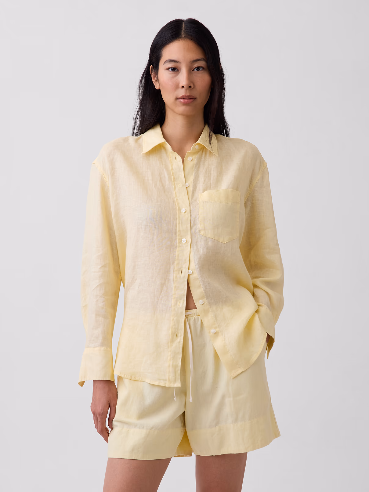
That softer quality is what makes the color useful rather than merely pretty. It can bring life to the usual summer materials — linen, cotton, straw, raffia, gold, canvas, worn denim — without making the whole outfit about color. I have been noticing it in places I would not normally look to yellow for: a few dresses, swim, men’s button-downs, a dressier top, silk taffeta cargo pants, and the elusive pale yellow manicure that always looks beautiful in theory and is surprisingly hard to get right in real life.
The shade has to be exact. It needs a little cream in it, sometimes a little warmth, and maybe the faintest bit of dust. If it is too bright, it takes over. If it is too pale, it disappears. If it is too sweet, it loses sophistication. The butter yellow I like should look good next to a white shirt, a straw hat, gold jewelry, a pair of jeans, or at the corner of a table at lunch. That's usually how a color catches my attention: not by how striking it looks alone, but by how naturally it lives among everything else.
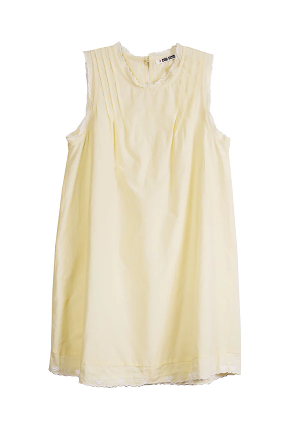
The Ciao Lucia Ebba dress is the most romantic version in this edit, with its dainty pleating and soft summer shape. I would keep everything around it very simple: a flat sandal, a small gold earring, and hair that looks incredibly natural. The dress already carries the romance of the color, and adding too much would only make it feel less sure of itself.
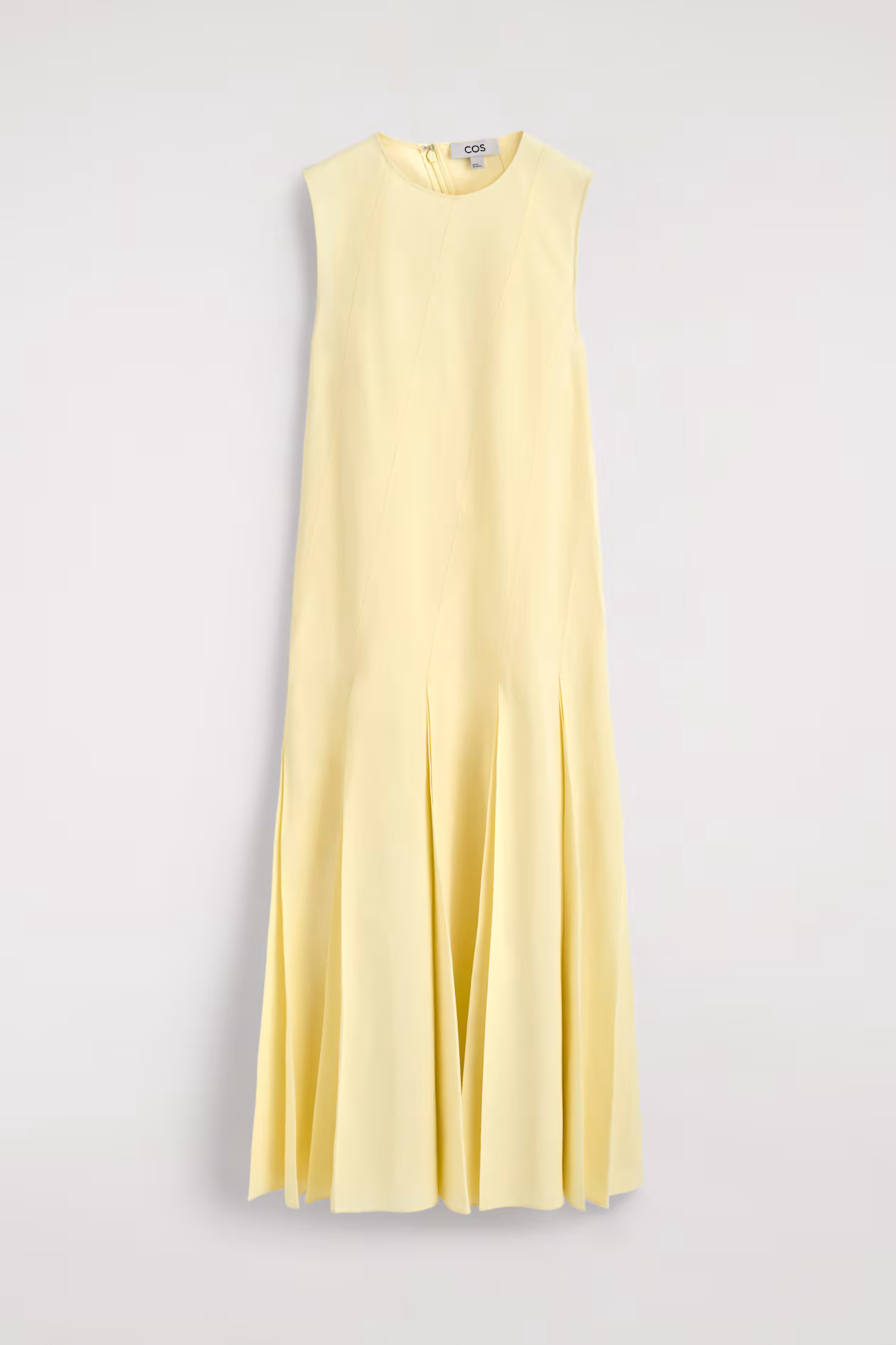
The COS pleated linen-cotton maxi dress makes a more practical argument, which I mean as a compliment. It has the ease of a white summer dress without being another white summer dress, and the pleating gives the color movement instead of letting it sit flat. This is where butter yellow starts to behave almost like a neutral, because the dress could take a straw bag, a flat leather sandal, a cardigan, a swimsuit underneath, or nothing more than sunglasses and still feel complete.
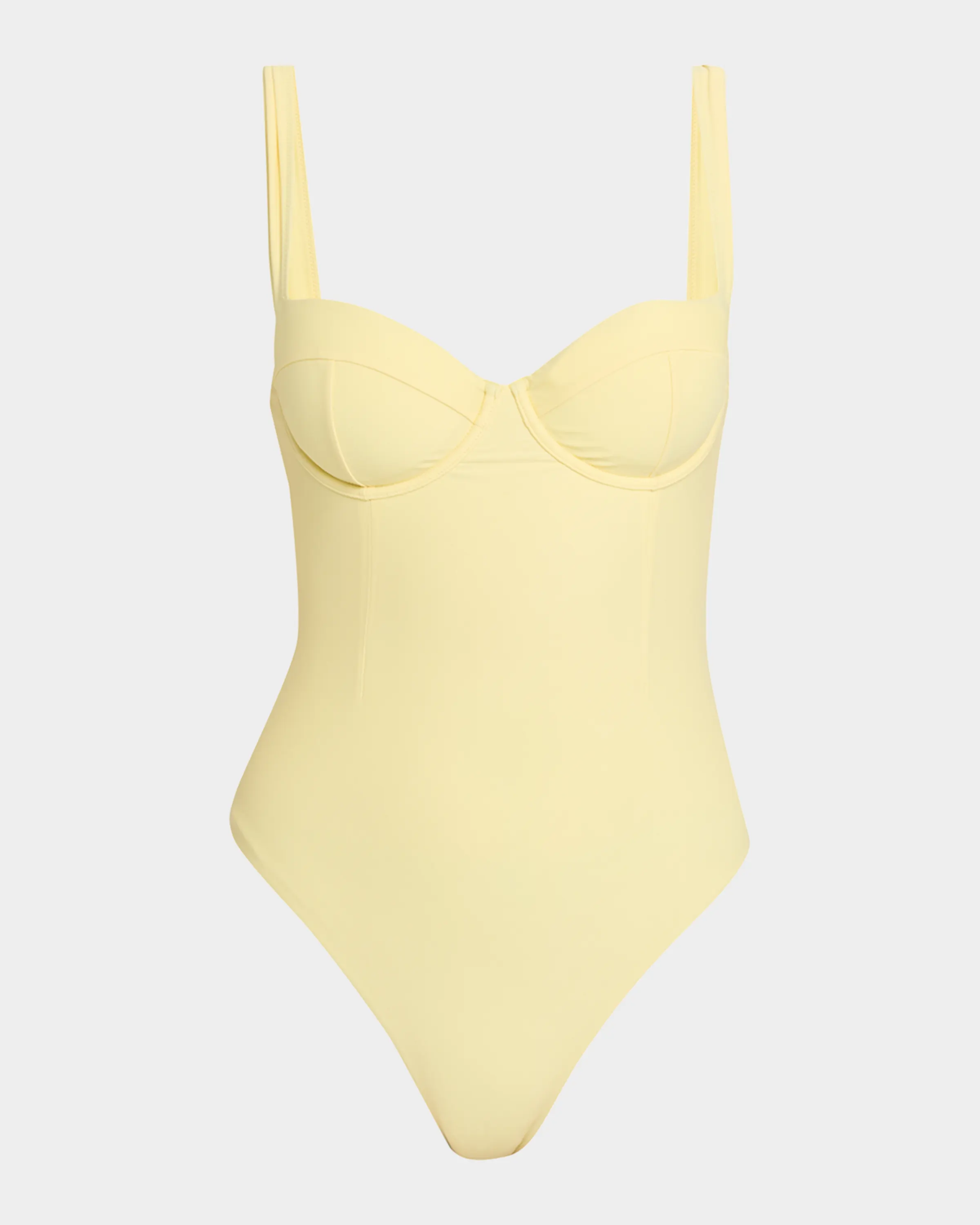
The swimsuits make the color feel even more connected to summer, though not in the obvious way. The Faithfull Rocio one-piece has the softer holiday feeling I like in this shade, especially with a straw hat, a linen shirt, or something loose thrown over it. The pale yellow keeps it from feeling as stark as white swim can, while still giving that clean, sunlit effect.
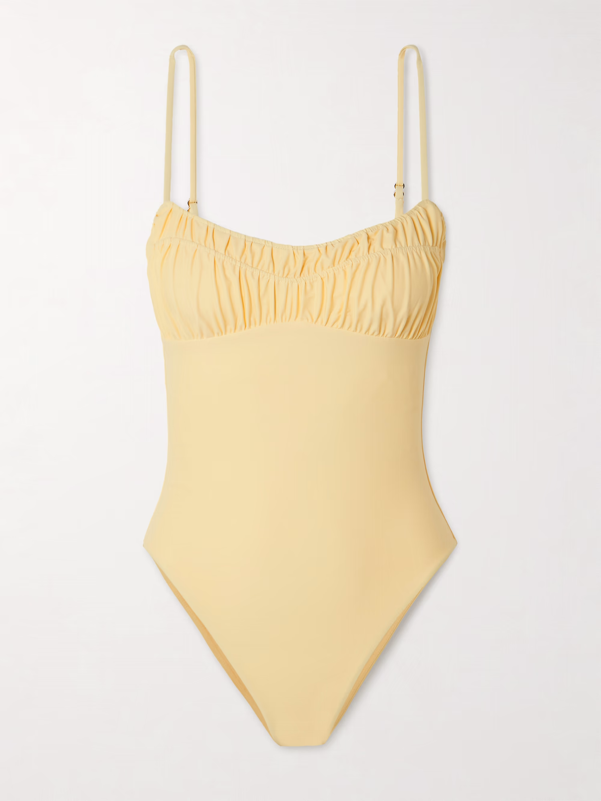
The Simkhai Kyle Bustier one-piece is sharper. The bustier shape gives the pale yellow structure, which is what makes the piece feel more sophisticated. I like the contrast of a soft color on a more architectural swimsuit, especially because it could easily continue after the pool with a linen skirt or wide-leg trousers.
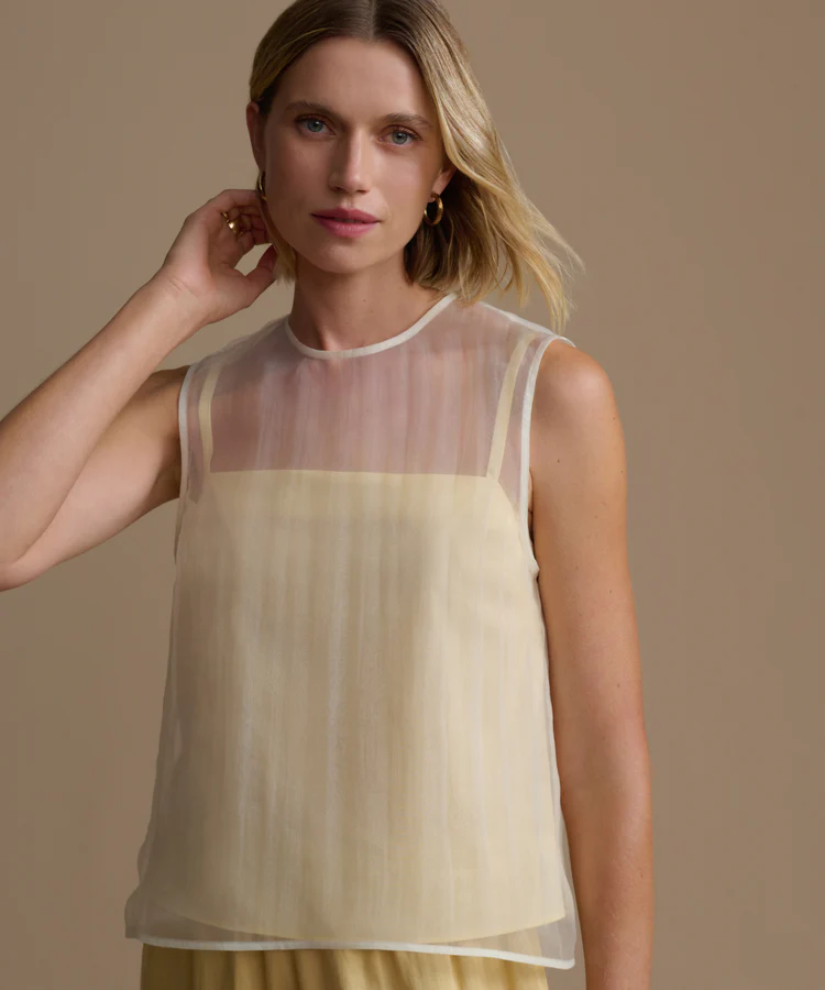
The Jenni Kayne Cora top moves butter yellow into a dressier place. The sheerness gives the color atmosphere, but the shape keeps it clean, which is exactly what this shade needs when it risks becoming too soft all over. I would wear it with loose trousers, a simple sandal, and very little jewelry, though I also like the idea of grounding it with black.
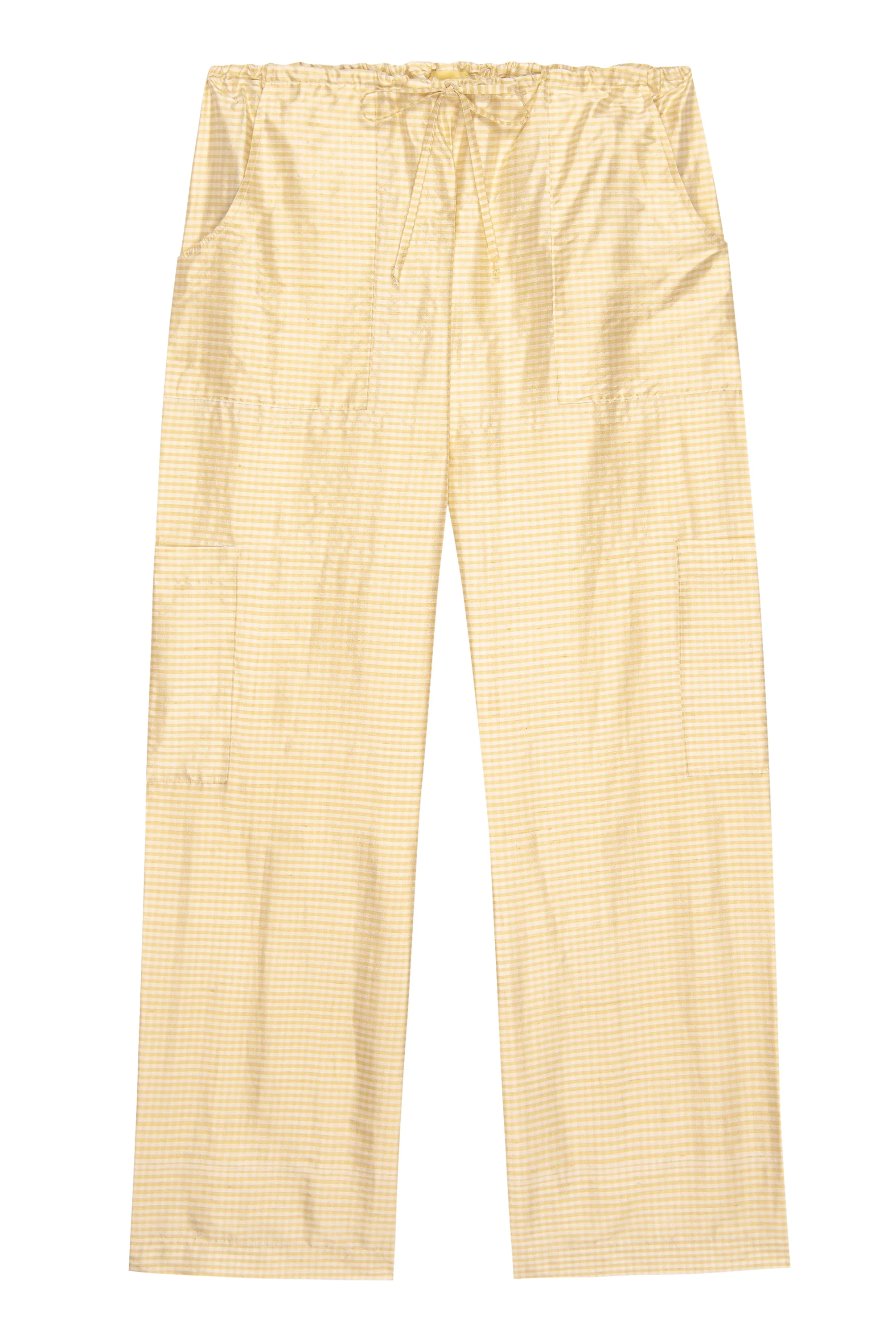
The Donni silk taffeta cargo pants are the least obvious piece in the group, which makes them the most interesting to me. Butter yellow in a dress makes immediate sense, but butter yellow in silk taffeta cargo pants has more tension. The fabric gives the pant polish, the cargo shape keeps it from becoming precious, and the color sits somewhere between the two. I would wear them with a fitted white cotton button-down, sleeveless if possible, clean jewelry, and either a flat sandal or a simple heel. The pants already have enough going on, and the whole point is to let that tension stay intact.
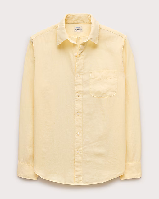
I would not leave men out of this color either. A men's butter yellow button-down can do what pale blue usually does, only with more warmth. It looks good with denim, khaki, navy, white trousers, or thrown open over a tee when the shirt is relaxed enough not to feel like office wear. The wrong yellow on a man can look too deliberate, but a very pale one can be easy in the best way.
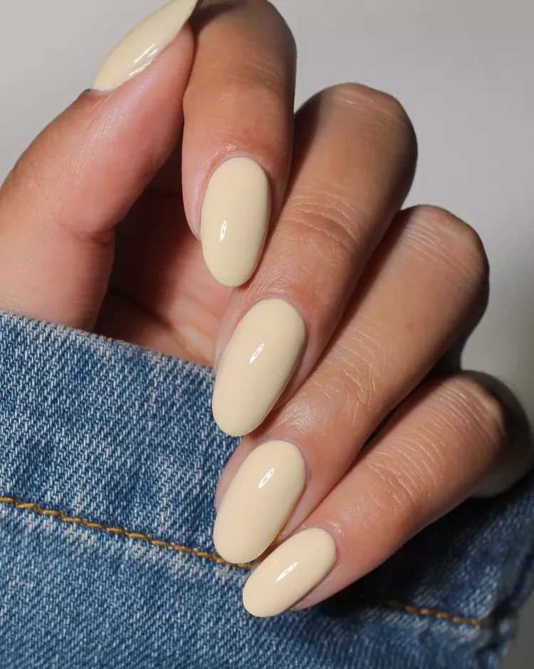
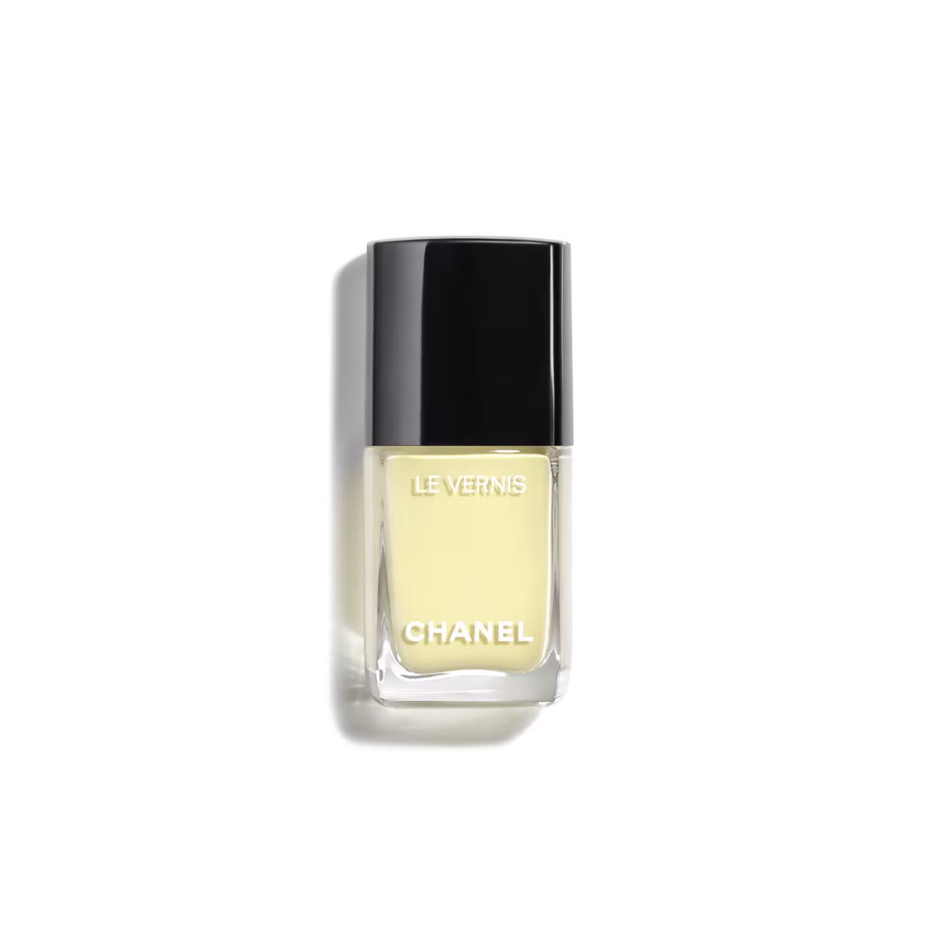
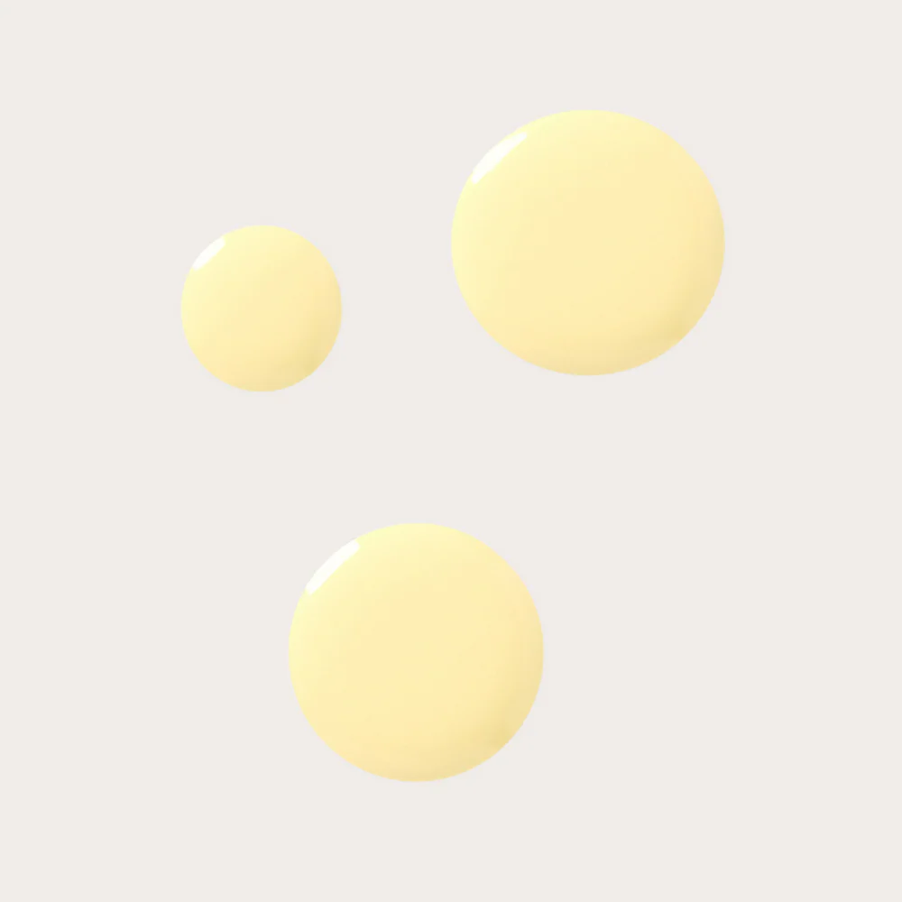
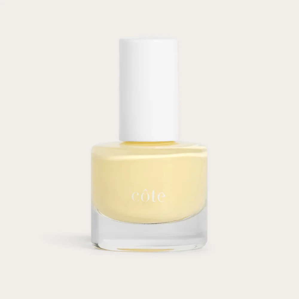
The manicure may be the most tempting version, especially once the weather stops feeling fresh. White can look stark, nude can feel expected, and pink can feel too familiar, but a pale yellow manicure gives the hand a little lift without being severe. The right shade needs to be pale but not chalky, creamy but not thick-looking, and glossy enough to feel polished without becoming the first thing anyone sees. My top faves for this shade are Chanel's Le Vernis nail color in pale yellow and Cote Butter Cup pale yellow nail polish.
Butter yellow works because it brings color into the wardrobe without demanding that everything become about color. It warms up white, softens black, makes denim feel less ordinary, and offers a little optimism without tipping into obvious cheerfulness. It is not beige, not cream, not white, and not quite yellow in the usual sense, which is exactly why it feels so useful in summer.